The student psychology and digital behaviour of adding the video landing page connects to how high school students may feel anxious or nervous about enrolling in college. Studies have shown that adding a video landing page can actually increase 86% of conversion rates. Adding an introductory video can bring a sense of calmness to the high school students because they are watching short clips of students who were in their position previously. This creates an emotional connection between the high school students and the first-year students featured in the video.
The student psychology and digital behaviour of adding a visual fun fact section is that the visuals provide the same information load that vomits of texts would but in a more effective way for scanability, long-term memory and reduce eye strain from reading. We need to realize that visuals are processed 60,000x faster in the brain and by default our brains process 90% information visually. Local domestic high school students will naturally scan for visuals rather than reading long-blocks of text, which will cause confusion because these are high school students with little to no knowledge about College, so the information must be easy to understand, specifically 8th grade level comprehension.
The student psychology and digital behaviour of adding the social media pages visuals is that local domestic students want to connect with current college students who have gone to the same high school. They want to see visuals on popular social media platforms instead of written stories from first-year students. Visual content is ready to be posted on social media while being easily shareable for the high school students to engage with. Going back to the statistics, researchers have studied the effect of text-written content and how individuals retain it after three days, which comes out to only 10-20 percent. On the other hand, visual information holds a value of 65 percent and growing, after three days of retaining the content. These visuals posted on St. Clair College’s social media page, has a much bigger effect on the information it holds, helping local domestic high school students to both share what interests them and reflect more on enrolling to St. Clair College because of the visual information retaining much longer in their brains.
The video landing page would improve recruitment effectiveness because it is an introductory video targeted towards incoming first-year students. It would include all required information such as the campus life, events, clubs, etc.
The visual fun facts section would improve recruitment effectiveness because it provides a more interesting way to learn the fundamentals of college life rather than long blocks of text. Local domestic high school students want to view college as fun rather than serious because they may be already stressed about starting, so adding the visual fun facts section can increase recruitment rates.
The social media pages visual section would improve recruitment effectiveness because students are more likely to check out the social media pages about students experiences rather than browse through the St. Clair College website, reading various texts about all sorts of information that may not interest the high school students. The social media pages would feature students stories regarding first-year and which high school they came from, and more.
For the video landing page, a visual improvement could be ensuring that they include more visuals of students’ faces and their personal experience at the college. High school students are new to college life and they expect to see first-year students like them who came from high school rather than heavily focusing on promoting enrollment with no engagement from their students.
St. Clair College should focus on the visual improvement of adding the fun facts visuals about the college and specifically the visuals should target what high school students need to know before enrolling. The visuals must capture the attention of the students within 2.8-8 seconds to retain information longer as these fun facts are important for the students so they come prepared rather than clueless in first-year.
A specific visual improvement for the social media pages visual section is that the content they post on their pages, should include the student’s experiences, similar to the video landing page. For example, St. Clair College should avoid snipping text-focused posts and more visuals with students winning awards, scholarships, etc.
Video landing page – St. Clair College missed the opportunity to add a video landing page on their homepage as an introduction to the college experience for their incoming local domestic high school students.
Visual Fun Facts – The issue that St. Clair College missed that they could’ve added multiple visual images that explain fun facts, targeted towards new students that could help guide them on what to expect when they enroll.
Social Media Pages Visuals – People are more likely to look at social media pages rather than a website, especially high school students. St. Clair College needs to add more visual engagement from what they post on their social media pages.
The image strengthens the post from a digital marketing perspective because I believe that the 3F’s play a part in this visual post incorporating all form, feeling, and function. The image captures the attention of the reader within 2.8-8 seconds. My reasoning for this is that I kept the visuals in the image very simple, with the main focus (the golfer) in the middle to help with scanability with no other visual distractions surrounding that would drift the reader away. Studies have shown that less text and more visuals can capture up to 94 percent more views with the brian to only take 13 milliseconds to process images. Visual hierarchy includes the image to seem “zoomed out” because of the negative space. The size of the visual golfer is intentionally smaller but remains clear and powerful as it acts as a negative image, ultimately increasing the emotional connection to the reader. The negative image sends alerts to the brain a “threat” and that they need to “survive” by avoiding the danger. In addition, 40 percent of people respond better to visual information. This can actually motivate the audience to take action to their problem, potentially even searching about what “GimmieLinks” has to offer from the visual post. The beautiful scenery of the trees, blue sky, grass, draws the eyes immediately and alerts the brain’s dopamine system to be released because the scenery of the image brings joy. Visuals are known to increase conversion rates but the real question is how do they. In the image, I include my brand signature to encourage engagement from the reader to get to know my business. This can increase conversion rates by 94 percent after the fact that I triggered their emotional cues from the “negative” image, allowing them to take more time to reflect and increase their motivation to make that change in their life.
I chose this particular image for my business because it represents the issue with golfers today, not being able to find a golfing partner. The visual of the male golfer on the putting green alone, emotionally connects with the viewer because it creates that resemblance of physiologically needing social interaction on the golf course. The headline clearly states the common problem in the image with the brands signature “GimmieLinks” below, to help guide the viewers to our website for a solution to the problem they’re facing. The target audience aligns with local Windsor-Essex golfers who relate to the image and themselves in the exact situation, on the putting green alone once again after showing up to their tee-time on a Sunday afternoon at Roseland, ultimately hoping that they will be paired up with another someone rather than playing solo. The goal of hitting a pain point that the Windsor golf community faces, I’m telling the audience that “I understand your situation and I can help you solve it” through the business signature after I triggered that emotional resemblance that they fear to sort out. The image intent is to trigger emotions from my audience about how lonely golfing can be at times. The goal for this image is to personally relate to each reader so they are seen from the brand, which can help increase their trust in my business. I believe this visual works better than alternatives because it aligns and sums my entire business in one image. My business helps individual golfers find a partner to play golf with. There are lots of empty spaces surrounding the man on the putting green, making it seem like it’s only him out there on the course with no friends, capturing the perfect opportunity to advertise my business as I offer services to help connect local golfers so they don’t have to play alone in future rounds.
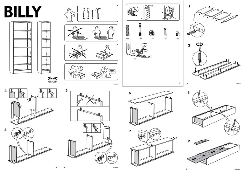
The first reason why visuals are essential to effective web content is simply because a large percentage of the population relies on visual content when processing information. Studies have shown that approximately 65% of the world’s population is visual learners, meaning they require content to be broken down into smaller chunks of visuals to properly engage with what’s being displayed in front of them. Rather than plain text, 40 percent of people respond better to visuals while only 20 percent of what’s written in your content, will be read. A real-world example that we discussed in class, refers to the IKEA assembly guide. The guide demonstrates visuals of the assembly but with a cartoon figure, avoiding as much text as possible. IKEA uses the analytic facts of how 65 percent of the world’s population are visual learners and only 20 percent of plain text will be read. They utilize a strong strategy to properly relate and engage with their consumers while being both impactful and memorable over text communication.
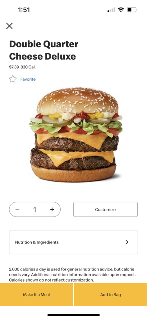
2. The second reason why visuals are essential to effective web content is because of how visuals stick to memory much better over long-term periods. Researchers have studied the effect of text-written content and how individuals retain it after three days, which comes out to only 10-20 percent. On the other hand, visual information holds a value of 65 percent and growing, after three days of retaining the content. The science behind this study is that naturally our brains transmit 90 percent of information to visuals. Meaning processing an image at just 13 milliseconds, and registering 36,000 messages per hour. Implementing plain text instead of visuals into web content will gradually slow down conversion rates from mobile users as 53 percent of those users will leave after just three seconds of the page not loading properly from large summaries of text needing to be downloaded onto the device before being seen, keeping in mind that mobile accounts for 60 percent of web traffic. Compressed images and icons that are less than 300KB and utilize formats such as WebP, AVIF, SVG and JPEG, can reduce slow speeds as they use much less storage and data to download. A real-world example of this is when you are at McDonald’s and prefer to order online through the app’s menu. Upon opening the app, you are greeted with a high-quality, responsive visual of the cheeseburger deluxe, rather than lines of “Cheese Burger Deluxe, made with 100% Canadian Beef and loaded with your favorite condiments”. Referencing back to how humans process an image at just 13 milliseconds, when they view the visual of the juicy, vibrant burger appearing so quickly on their device, the user will identify what they want and complete the order before even reading the line of text.
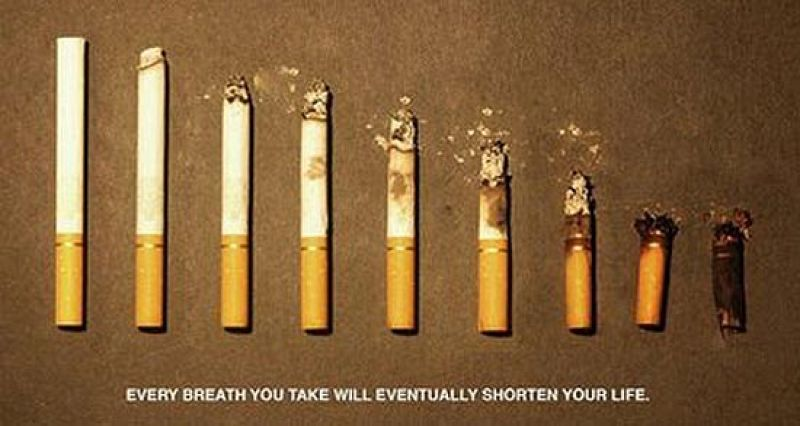
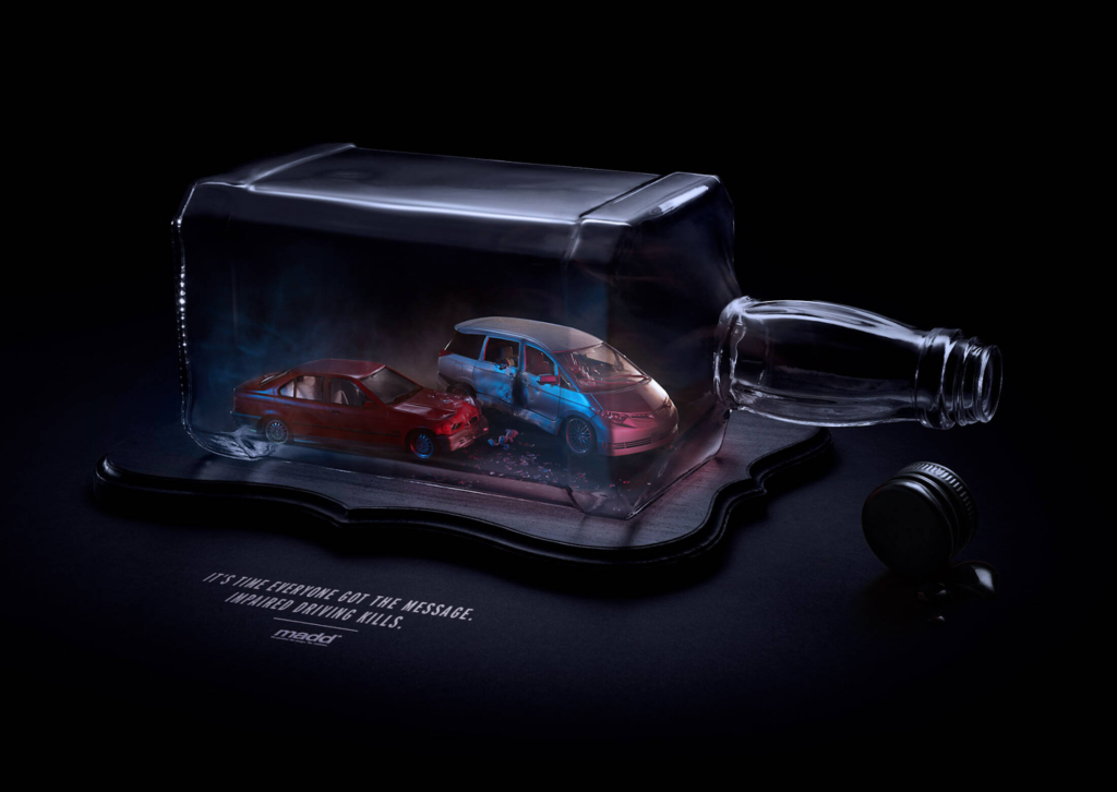
3. The third reason why visuals are essential to effective web content is that visuals can trigger strong emotions. Our brains store our visual memories inside of the medial temporal lobe, it processes emotions and expresses them. In class, we discussed the impact of a cigarette awareness image and how it made us feel. Negative images like the cigarette awareness, create a stronger trigger for emotional emotions. Researchers can’t actually prove why this occurs but the way I see it is that when a negative image is being displayed, individuals tend to pay more attention to it, rather than if a positive image was shown because it sends alerts to the brain that there is a “threat” and that they need to “survive” by avoiding the danger. In addition, 40 percent of people respond better to visual information. So the cigarette awareness image can actually emotionally motivate individuals to quit smoking as it shortens their lifespan. A real-world example of this is the MADD (Mothers Against Drunk Driving) association and their powerful story-telling images. Triggering the connection between visual stimuli and medial temporal lobe of the brain, it creates the alert of threat and survival, capturing the attention of the reader and promoting motivation to not drive under the influence.
What I learned from this assignment is how to properly implement the F-pattern layout for better scanability for my readers. In my original introduction article, I added too many unnecessary complex-language, not knowing that my readers will scan and not read every word. By focusing on replacing complicated-sentences with direct verbs such as “provide the opportunity” with “finding the perfect local golfer has never been easier”.
In addition to reducing complex-language, I applied this strategy with the services bullet-points section in the article. I removed certain “golf terms” such as “establish your handicap” to “track your scores each round”. Knowing that some of my readers will not know what a “handicap” is due to their golf skill-level, I substituted those certain keywords from the definition to be understandable from the view of both non-golfers and experienced-golfers.
Including the use of important keywords such as “Windsor”, and “Golfing Partner”, I placed these keywords on the top-left of the page as studies have shown that 80% of visitors scan that area on a page, skimming over everything else around it. I added larger headers to capture the attention of the readers, making it seem like a navigation point when they stop to read what it is and if it correlates to their needs. Upon experimenting myself, I found it much quicker using this strategy as I know the reader, including myself, will not read every word, but rather scan the page using the F-pattern layout.
At the end of the article, I added a call-to-action “Visit our website and sign-up today to find your perfect golfing partner: www.gimmielinks.com”. This CTA navigates the visitor to their needs, which is to find a local golf partner. I learned that by adding a small message next to the CTA, it helps to remind the audience of their needs to be fulfilled, rather than just the link to my website.
The most challenging aspect of applying the F-Pattern and Plain English writing principles was making sure that the audience knew what GimmieLinks was about in a professional tone while avoiding complex language and longer/harder keywords in sentence structures. Before learning about F-patterns and the statistics behind how audiences view your content, I would constantly write long over-complicated paragraphs, using advanced keywords to seem “professional”. Looking back, I realized that the majority of visitors will not stop and read each word but rather scan certain areas in the F-pattern horizontal/vertical layouts.
What I did to overcome these old habits was I valued certain informative keywords such as “Windsor”, “Golfing Partner”, “PGA”, and more to the left side of my page, under headers for easier navigation since scanability is key for my visitors. As stated in previous questions, Instead of writing long-text paragraphs for each of my services, I cramped it down into a bulleted list with minimal simple text for better comprehension, capturing the attention as the bulleted points follow the F-pattern layout.
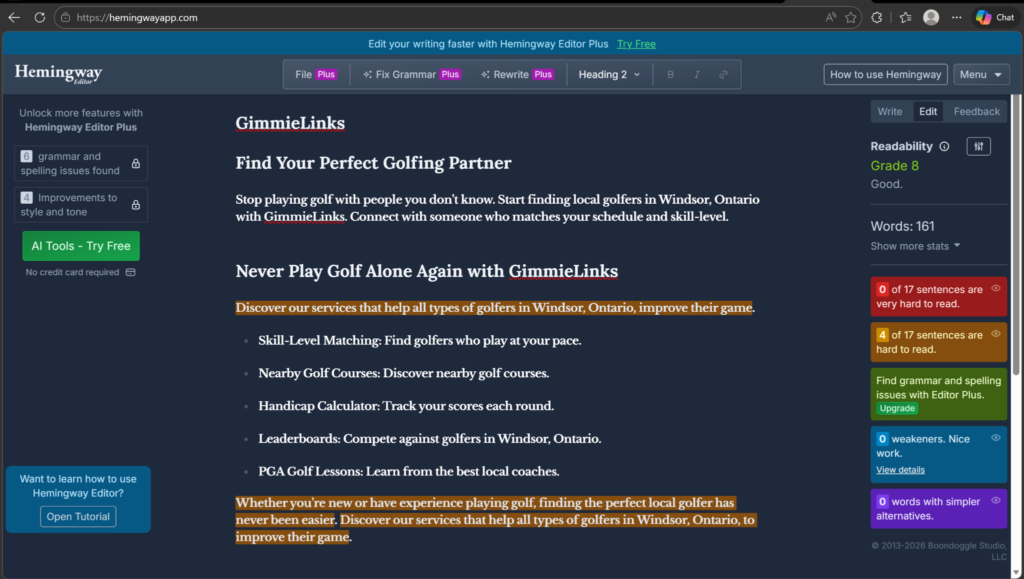
One specific technique that I used to improve readability in my revised version was I used bullet-points to describe the services that GimmieLinks has to offer for better scanability, rather than using long-complex sentences. The reasoning behind the strategy is that the F-pattern supports vertical scan down the left side, where the majority of readers scan that area in hopes of finding relevant and important information at a much faster pace. To test this strategy to see if it improves readability, I used a popular tool called Hemingway Editor, to rate my readability score. The score I achieved was Grade 8 readability, which is what I was aiming for, making this strategy a success!